Service Navigation
Search
1. Forecasts and uncertainty range for a single location
ICON-CH1-EPS and ICON-CH2-EPS can be used to aggregate the 11 or 21 varying weather forecasts for the coming days at a particular location and thus arrive at an assessment of the uncertainty of the forecast for that location.
2. Representation of individual forecasts
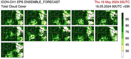
The individual ensemble forecasts for a certain point in time can be represented in the form of so-called stamp maps. This enables an optimal spatial comparison of the various realisations of the forecast. The differences between the individual maps allows conclusions to be drawn regarding the reliability of the forecast: the more similar the various individual forecasts are, the more reliable the forecast.
3. Probability maps
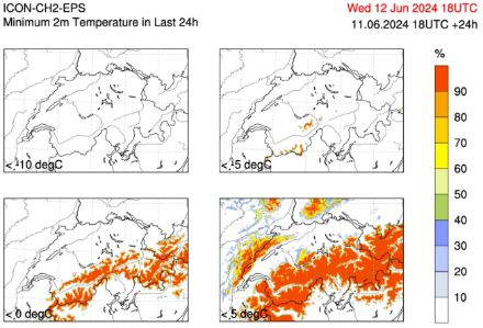
The ICON-CH1-EPS and ICON-CH2-EPS ensemble forecasts can also be used to produce probability maps, e.g. for precipitation. These maps show the probability of a specific event occurring. The information on the probability that an event will occur can help users to make decisions.
Another example is the probability of the temperature going below a certain minimum level: shown here for -10°C, -5°C, 0°C and +5°C. Here, the colour indicates the probability that the minimum temperature will be below the given temperature that day.
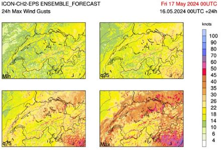
4. Quantiles
The distribution of the various model calculations of an ensemble can also be represented by quantiles. In a spatial depiction, the minimum wind gusts forecast by the ensemble for each location in Switzerland is determined and represented with colour coding. Any number of quantiles can be depicted in this way, as shown in the figure below with the 25% and 75% quantile (25%/75% of the gusts predicted by the ensemble with lower wind speeds than the value shown in colour), as can the maximum value from all ensemble forecasts. The closer the values of the various quantiles lie to one another, the more certain the forecast.