Service Navigation
Search
Methods used
According to Extreme Value Theory, the largest values of a quantity (say daily precipitation or one-second wind gusts) taken each over intervals of the same size can be used to infer this quantity’s extreme behavior, i.e. at a level we have not yet experienced. These maxima are said to follow a Generalized Extreme Value distribution (GEV). The observations behind the extreme value analyses presented on this web site are therefore seasonal and yearly maxima.
Bayesian inference was used for estimating the return levels. The advantage of this approach is its more comprehensive account of uncertainties.
We estimate a range of GEV distributions that are all compatible with the observed measurements. This range is expressed in terms of a large number of simulated distributions, perhaps a thousand, each of which provides a return level estimate.
For a given return period, we therefore obtain a distribution of return levels rather than one return level. For each return period on the return level plot (i.e. for each position on the abscissa), the return level displayed (the corresponding point on the blue line) is the median of the return levels for all estimated GEV distributions for this particular return period.
An important consequence of this procedure is that the resulting curve (the blue line) on the return level plot is no longer a GEV distribution. Nevertheless, for a given return period, for instance 50 years, the value of the blue line, say 80mm/day, can be interpreted as the amount of precipitation exceeded only about 20 times in a 1000 years (with the same climate).
In the Bayesian framework, the confidence intervals can be understood intuitively: there is a 95% chance for the true value of the return level to be within the 95% confidence intervals.
When we apply extreme value theory to yearly maxima, we assume that, within a given year, the processes leading to precipitation remain the same. Of course, this is not always true: precipitation processes often depend on the season. In other words, by using yearly maxima to estimate our return levels, we could be violating the conditions required for a reliable estimate.
In order to avoid this, we first estimate the return levels for each season separately, using the seasonal maxima, and then derive the yearly return level from the seasonal ones numerically.
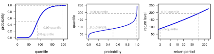
Return level plots display the probability that a given value is exceeded. The probability is expressed in terms of years. Thus a value that has a probability of 1% of being exceeded in any given year is - in the (very) long term average - expected to be exceeded once in a 100 years. Then, the value, or "return level'', is said to have a "return period'' of 100 years. In fact, return levels are extreme quantiles: the 100-year return value has a probability of 0.99 of not being exceeded, and therefore corresponds to the customary 0.99-quantile (cf. further information).
To focus the attention on the behavior of the rarest events, return periods are transformed in such a way that the relation to the return levels will appear as a straight line for a Gumbel distribution of the yearly maxima (see report).
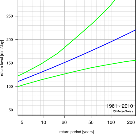
The return level plot summarizes the extremal behavior at a glance. A range of 1-day-precipitation amounts (y-axis) is plotted against their exceedance probabilities expressed in terms of average number of years (x-axis).The return level plot summarizes the extremal behavior at a glance. A range of 1-day-precipitation amounts (y-axis) is plotted against their exceedance probabilities expressed in terms of average number of years (x-axis).
The extremal behavior of daily precipitation at the station Genève-Cointrin can be deduced from the return level plot: The return level estimate (blue line) is slightly negatively curved, which suggests that beyond a given daily precipitation amount, the probability that an amount should be exceeded is zero. The strong positive curvature of the upper confidence bound (green line), on the other hand, reveals that this extremal behavior is subject to uncertainty: It is possible that any amount of daily precipitation could also have a non-zero probability of being exceeded, and this probability would decrease rather slowly (i.e., polynomially). This means that very severe events would have a non-negligible probability of being exceeded.
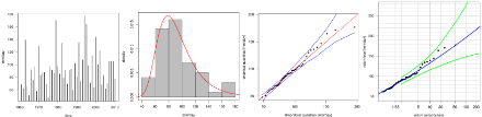
The time series of annual maxima (figure left) informs visually about missing data or possible trends or cycles. Here, the variation in the annual maxima could well be due to random effects.The histogram (figure second left) shows the frequency with which the annual maxima have been recorded, and can be understood as the empirical PDF.
The quantile-quantile plot (figure second right) helps to decide if the quality of the fit is reliable: If the model is appropriate for the data at hand, the empirical quantiles of the data should approximately agree with the estimated quantiles, the more so for a large sample. In such a case, the dots would align approximately on the diagonal. If, for instance, for the upper quantiles, the empirical quantiles were systematically smaller than the fitted ones, this would suggest that the tail of the true distribution may decay more rapidly than that of the fitted distribution. At Genève-Cointrin for daily precipitation, there is no systematic under- or overestimation of the tail. The variation of the points around the red line could perhaps be reduced, by, for instance, modeling the seasonality of daily precipitation extremes explicitly.
The return level plot (figure right) displays black dots called "plotting points'' . The position of these plotting points on the y-axis corresponds to the values of the observed maxima. Since the true return period of these events is unknown, however, the position on the x-axis is determined empirically from the sample size. Thus, for a sample size of 50 years, for instance, the largest observation will be assigned a return period of approximately 50 years, the second largest a return period of approximately 25 years, and so on. In other words, it does not represent the local behavior of the quantity of interest (e.g. daily precipitation) at the particular station under consideration, since the return period would be the same regardless of geographical location. Some conclusions can, however, be drawn from the comparison between plotting points and best estimate (blue line, figure right): any substantial or systematic disagreement between empirical and GEV estimates, after allowance for sampling error, suggests an inadequacy of the model.
Reliability of results of the extreme value analysis is poor – What to do?
Each extreme value analysis is tested for its reliability, and the verdict is stated on the main page. This verdict does not pertain to the inherent uncertainty of the estimation due to the limited sample size. Rather, it describes the possibility that the assumptions motivating the choice of the statistical model may not be fulfilled.
If the reliability is poor, for instance, the model represents the observed extreme values badly. Three degrees of reliability have been defined: poor, questionable, and good. Their meaning and what to do in each case is shown below.
Reliability of extreme value analyses
| reliability | interpretation | action |
| poor | Observed extreme values are badly represented by the model | Do not use this statistical model. Use largest observed events or closest reliable station instead. |
| questionable | Observed extreme values are not well represented by the model, the underlying assumptions might be violated. | Careful assessment necessary. Use visual guides (tech. report, p. 32) to decide. If points line up – proceed as usual; if not – same action as for poor fits. |
| good | Observed extreme values are well represented by the model. | The statistical model can be used. |
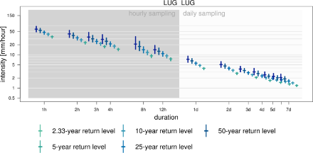
The intensity diagram reveals at a glance the behavior of very intense precipitation at different durations. It is purposely presented in a form similar to the Intensity-Duration-Frequency (IDF) diagrams familiar in the field of hydrology, but differ substantially in content: the return levels represented here were estimated for each duration separately, based on precipitation data measured at hourly intervals. No relation is assumed between precipitation intensities at different durations, and therefore no dependence of intensity on duration was assumed to infer return levels at short durations (see Technical Report of MeteoSwiss 255 for details).
In this diagram, both the x-axis and the y-axis are log-transformed. Thus, differences at small intensities are magnified, whereas differences at large intensities appear smaller than they are. This transformation of the y-axis highlights the fact that the intensity of precipitation tends to decrease as the duration increases. Unfortunately, as the uncertainties are log-transformed as well, they mislead the eye when comparing sizes, for instance when assessing the symmetry or asymmetry of the confidence intervals about the best estimate.
The background color indicates the different observations used for the analysis. The statistics of the sub-daily durations are based on annual maxima of fixed interval measurements over one hour (hh:40 - hh+1:40), the aggregations of which are based on sliding sums. Analogously, the multi-daily estimates are based on annual maxima of daily observations over a fixed interval (5:40 - 5:40 UTC) aggregated in sliding sums.
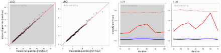
Random deviations from the perfect estimate (red line, on the left-hand-side) are to be expected; they should not, however, form a pattern or spread too far on either side of the diagonal. As the quantiles for shorter durations have (by construction) higher values than for longer durations, the information on these QQ-plots is not as valuable as for the extreme value analyses of single duration precipitation sums. In particular, information regarding the fit of the 3-hour to 12-hour-intensities as well as of the 3-day to 7-day-intensities is limited: in this example, there is a hint that higher return levels for 3 and 4-hour-intensities might be of questionable reliability. But overall no systematic deviation is visible.
Additional information regarding the goodness-of-fit and therefore an assessment of the reliability of the results can be seen on the right-hand-side. If the solid line lies above the dashed line, the quality of the fit for this specific duration is questionable. The AD statistic focuses on the estimation of high return levels. Should the RMSE show only random deviations (i.e., all values lie below the dashed blue line), but the AD statistic lie above the dashed red line, the smaller return levels could still be used, whereas the larger ones are probably unreliable.
Here, the RMSE for 6-day-intensities corresponds to the critical value. The AD statistics for 6-day-intensities lies above the critical value. Therefore, for this duration careful judgment of the comparison of the return level estimates with observations is necessary and, if available, information regarding the extreme value analysis of the 6-day precipitation sums should be consulted.
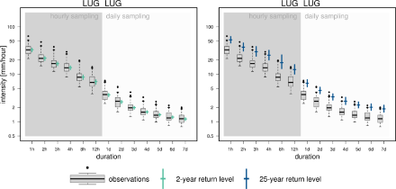
The comparison of the empirical quantiles with the 2-year and 25-year return level estimates can provide insight into the quality of the fit for the range of already observed intensities: At Lugano, the intensity diagram is based on 34 years of hourly observations and 50 years of daily observations. As we consider only annual maxima, we expect the 2-year return level to be close to the median, i.e., the 2-year return level is expected to have been exceeded every other year. We expect the 25-year return level, however, to have been exceeded only once or twice during the full time period. Thus averaged across sub-daily durations it should be close to 1.4 times per duration; for daily and multi-daily durations close to 2times per duration. For both return periods, the comparison with observations reveals no apparent misbehavior of the fit.
What to do when the reliability of the intensity diagram is poor?
Each precipitation intensity extreme value analysis is tested for its reliability, and the verdict is stated on the main page. This verdict does not pertain to the inherent uncertainty of the estimation due to the limited sample size. Rather, it describes the possibility that the assumptions motivating the choice of the statistical model may not be fulfilled.
If the reliability is questionable, for instance, the model does not represent well the observed extreme values of precipitation intensities for some of the durations. Three degrees of reliability have been defined: poor, questionable, and good. Their meaning and what to do about them is shown below.
Summarized reliability of extreme value analyses for multiple intensities
| reliability | interpretation | action |
| poor | For some durations, the observed extreme values are badly represented by the model. | Do not use return level estimates. Use the boxplots of largest observed events for a first impression; consult statistics of the annual maxima of precipitation sums if they are available and reliable. If some durations show no problems, the estimates can be used tentatively. Otherwise use the closest reliable station. |
| questionable | For some durations, the observed extreme values are not well represented by the model. | Careful assessment necessary. Check the quality of the fit with the presented visual guides. If only single intensities are of interest: check if the duration of interest shows apparent problems. If it doesn’t, proceed as usual; if it does, same action as for poor fits. |
| good | For most durations, the observed extreme values are well represented by the model. | The return level estimates can be used. Overall, annual maximum precipitation intensities across durations are well represented by the estimated distributions. |